BrightCarbon’s Richard Goring Shares Why Infographics can Drive Compelling Proposals

Writing winning proposals goes beyond just powerful executive summaries and value propositions: visuals play a role, too. Attending my first Association of Proposal Management Professionals (APMP) BidCon last month, I heard from Richard Goring, a director of BrightCarbon, a Manchaster, UK-based presentation design agency. Richard, based out of the Boston office, gave an engaging presentation at BidCon and graciously agreed to be featured today on The Writing Well.
Q. Why do visuals matter in proposals? How much easier is it for our brains to synthesize visual cues?
Despite the popular phrase, most books are judged by their cover, which usually has some lovely visuals on it. The same is partly true with proposals. The use of graphics makes it more inviting, opening up the dense copy to give a sense of space, and in general be more appealing to the reader. Of course, that’s superficial, but it’s an important first step, to get someone to actually want to read your proposal.
Assuming they’re reading it, visuals are important to help people navigate through a document, to identify relevant topics, or find content they’ve already read. The visuals can act as cues or markers that stand out in a way that a wall of text simply doesn’t. They’re making things much easier for your reader, allowing them to focus more time and effort on what you’re actually saying.
Then, visuals also help people to understand things more clearly. Infographics in particular are a huge boost to aid comprehension, bringing an elegance to complexity that text often lacks. There are many examples of a single graphic conveying information both beautifully, but also efficiently. Minard’s March of Napoleon helps you understand what happened over a six-month period. And it’s that efficiency which is also key, giving your reader the information they need quickly so they can act upon it.

And finally, visuals are critical in a proposal as they help your prospect remember the information you’re presenting. The picture superiority effect is the name for this, and it’s been demonstrated that three days after receiving information, you’ll remember only 10% of the information that you read or hear, but 65% of the information you see as a visual. Three days after reading your proposal is, perhaps, when your prospect is likely to make or justify their decision to choose you over everyone else. If you can help them to remember more of what makes you better, what value you deliver, and how easy it will be for them, then you’re much more likely to be successful.
Q. What are the biggest mistakes proposal writers make when it comes to graphics or the visual aspects of their storytelling?
To not use a graphic that’s useful. Often visuals are put into documents purely to make them look better, but it doesn’t help achieve your objective. Or you’ll see so-called infographics that are simply a collection of icons next to some bullet-point text. To be fair, this can have it’s place if it’s appropriate for the content, but all too often the author has used some default SmartArt-type graphic that contributes nothing to the information.
Remember:
“Always think about the story you’re trying to tell. Consider what graphic will get the point across more clearly, rather than just what will fit.”
– Richard Goring, BrightCarbon
My recommendation would be to always think about the story you’re trying to tell. Consider what graphic will help get the point across more clearly, rather than just what will fit. And don’t always try to fit in too much. A collection of small and simple processes, pyramid diagrams, and bar, line, and pie charts are probably more effective than an over-complex graphic where you’re trying to fit everything in. But if you can find a way to link it all, it can be really powerful. Often things like a process flow, map, or bubble, matrix, or waterfall charts are good ways to combine lots of points or data in an elegant way. It can be complex, but we’ve got a step-by-step process to follow to create visual infographics that can help kick things off.
Q. What are some best practices for creating compelling visuals – especially infographics?
Think about your audience, your objective, and what the story in the graphic is. Remove anything that you don’t need and make sure it’s clear what the graphic is about, with some kind of context-setting element to it (like a title), and some kind of summary (like a punchline), to make it really clear why this is important and how your prospect benefit.
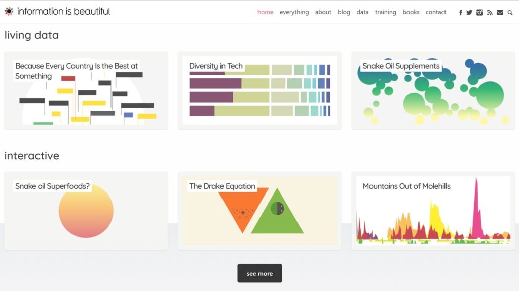
With the story in-place, you need to think about what will make the biggest impact in the graphic itself. Often that’s going to be contrast. Comparing one thing with another, or at least providing context for the information that you are presenting. For example, don’t just show how long your process takes. Show that it’s 40% shorter than what they currently have, or the next best competitor. You can see a summary of a masterclass we run on how to create compelling infographics, but I’d also encourage you to check out Information is Beautiful for inspiration on the kind of infographics you might be able to create.
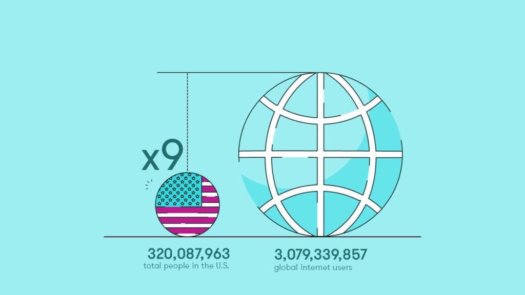
Once you’ve got a graphic, make sure that it’s of good quality. Another common mistake is using a low-resolution image, which not only looks unprofessional, but is usually pixelated and difficult to read. I’m a big fan of using vector graphics, which scale easily, and any text in them can also be searched or accessed by a screen reader. They’re easy to create in tools like Adobe Illustrator, but you can also create vector graphics really easily in PowerPoint, for example. All the shapes you draw or graphs you create are all vector graphics by default. The same is true in Excel.
If you’re using Word to create the proposal, you can group all the objects in your PowerPoint infographic together (select all with Ctrl + A, then group with Ctrl + G) and simply copy and paste into Word, where the graphic will be treated as a single object. Just don’t paste it as a picture. If you do that, those lovely, crisp, clear, scalable vector graphics will be turned into a raster graphic, which means it can become grainy and won’t resize easily.
Q. Can you illustrate these best practices with an example of how you improved one aspect of a proposal or sales presentation (before and after)?
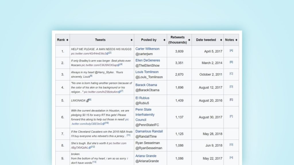
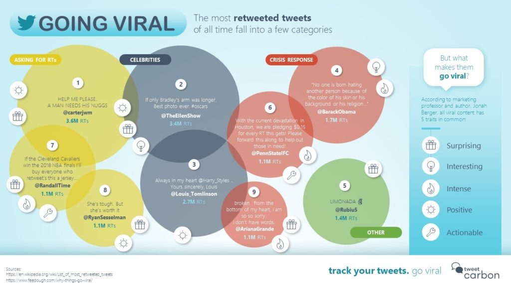
That’s tricky because of confidentiality, but some generic examples that use the same techniques, and are also on the simpler side making them to easier to see on the blog are this one, showing how you can turn a basic table of the most retweeted tweets into a bubble chart for data visualization, color coding for easier interpretation, and insight added on what attributes each tweet has.
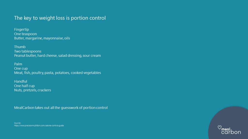
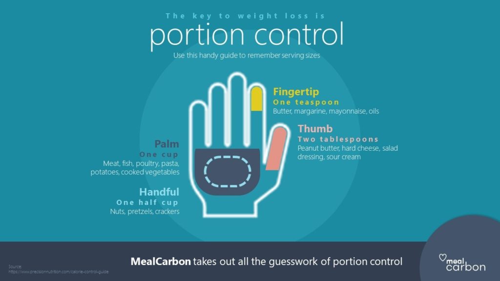
And this, which shows simple portion size information with a variety of foods, compared with an infographic with everything built around an actual hand to show you relative portion sizes and text hierarchies to allow easy comparison across different elements.
5. Many proposal writers have to create their own graphics using whatever tools they have (Microsoft Office suite). Any resources you recommend for helping them hone their graphics skills?
There are so many places for great resources. If you have Office 365, then PowerPoint and Word actually have icons built-in, so you can access scalable vector graphics. If not, then sites like Illustrio and The Noun Project are great sources for free. If you want something more custom, then check out Creative Market for loads of very inexpensive icon sets. For images, Pexels and Unsplash are both great sources of free, for-commercial-use images, and they’re all beautiful.
And then there’s building the graphic once you’ve got all the elements you need. BrightCarbon has loads of free online masterclasses and resources to help you with this. We get really great feedback on them and it all comes from being graphics creators ourselves and sharing the cool things we’ve learned or how to do things more quickly.
The Presentation Guild is another good source of ideas, with a community of people that create presentations of all sorts, often using lots of visuals and infographics. They run a great webinar series from some experts in the field. A lot of the content is member’s only, but it’s pretty inexpensive to join and you can get some excellent help in the forums.
Q. What software or other tools do you recommend?
Honestly, I’d probably suggest sticking with PowerPoint. It’s a versatile tool that everyone has. It won’t cause compatibility problems when sharing or co-creating graphics within the bid team. And it’s actually pretty quick, once you get into it. Tools like Abode Illustrator or InDesign are clearly awesome, and you can do so much with them, but they’re expensive and the learning curve is crazy, if you’ve not used them before.
That said, there are things you can add in to PowerPoint or support you. Build-a-Graphic is a neat tool that analyzes your content and suggests different infographic layouts. It also has loads of graphics, in many different styles for you to choose from, so it makes creating graphics (in PowerPoint) really quick and easy.
eLearning Art is another good option for loads of graphics. It’s main strength is in scenario-building, where you can have different characters doing different things, which is great for consistency across a set of graphics in a proposal.
Otherwise, outside of PowerPoint-based options, Canva and Vyond are both good options to create great content. Vyond is really about video, but makes it really easy, and more and more proposals are becoming multi-media, so it may be interesting to try.
7. Why did you start BrightCarbon? How does your firm differ from other creative agencies? What type of clients do you serve?
That’s very kind to ask. Shameless plug alert time! We started BrightCarbon because there’s a huge need for visual content, whether that’s presentations, animations, eLearning, or infographics, and it’s what we specialize in. Everything at BrightCarbon is built around the idea of communicating more effectively using visuals, and there aren’t many agencies that really do that (you’ll find everyone that does in the Presentation Guild).

We work with all sorts of people, because engaging graphics is something that’s required universally. It can be small companies that don’t have the time or people to do this themselves, up to large organizations that have their own in-house teams, but they don’t specialize in this field. Or, we offer training to those teams on how to do it themselves.
You can find out more about us on the BrightCarbon website, or follow us on Twitter @BrightCarbon, where we post lots of great resources and quick Twitter tips. We’re really happy to chat about anything visual-related and love to geek out about presentations and infographics.
Check out Richard’s next APMP webinar, “Repurposing Content – Do More with PowerPoint,” this Wednesday at 11 a.m. Cost is free for APMP members.

